
I thought I'd share the thought processes behind various elements of the big day, alongs with images showing how those ideas came together. Hopefully fans of the genre will appreciate the stylistic nods to the films we all so dearly love represented through traditional wedding fare.

So, why did I theme my wedding around Italian thrillers of the 1960s and 70s? Gialli is a major passion of mine, and I wanted to incorporate it into my wedding day on some level. However, the choice of theme went far beyond my love of old Italian thrillers. I'm deeply into design—whether it be in fashion, film, interiors, or architecture—so getting the right aesthetic feel for my wedding day was incredibly important.

The Venue


The Stationery
I knew I wasn't going to find the kind of wedding stationery I wanted online, and a cursory glance on Etsy confirmed this, so I decided to have some designed. I talked to a few people who were ridiculously expensive before putting a call out on Twitter for help. Luckily, an amazing graphic designer named Jaci answered my call. I told her the kind of thing I was looking for, and she got to work by setting up a Pinterest board where I pinned a load of images I liked from Italian genre cinema.
Jaci gave me really good advice, suggesting I pin images that had shapes and motifs I liked and wanted included in the invites, as well as potential typographies. Most of the images that made it to the final board are from Suspiria, but you'll also see Inferno, Five Dolls for an August Moon, A Lizard in a Woman's Skin, Seven Blood-Stained Orchids, The Frightened Woman, The Strange Colour of Your Body's Tears, and even Kubrick's 2001: A Space Odyssey represented.
After discussing the text, layout, and other features, Jaci went away and designed three options that matched the brief. I don't want to share Jaci's other designs here as they're not my work to share, but one of her original designs included a beautiful recreation of Suspiria's art nouveau doorways with the invite text inside the door. Ultimately, I rejected it because the kaleidoscopic look felt a little too much for a wedding invite, though the designs were really beautiful. Sadly, they weren't soft enough for the day, so we went back to the drawing board.
At this stage, I had a clearer idea of what I wanted and decided to use Pat's apartment lobby from Suspiria and her M.C. Escher walls as the major design elements for the wedding stationery. Jaci absolutely nailed this concept, as you can see in the beautiful invites below. Alongside the wedding invites, Jaci designed RSVP cards, place cards, order of service booklets, and evening invites.


The Tables
Contrary to what you might think, I was conscious of including my husband in the wedding planning, and I thought it was important to have his personality and interests represented too. Originally, I wanted to name each table after a different giallo director, but since my husband is such a fan of cinema in general, it didn't seem fair to exclude his passions from the table planning.
Instead, we decided to name each table after a director we both liked. While I managed to include a few giallo directors, we also included several non-Italian directors. Our tables were named after: Dario Argento, Mario Bava, Fritz Lang, Martin Scorsese, Brian De Palma, Stanley Kubrick, David Lynch, Francis Ford Coppola, and Nicolas Winding Refn.

I bought nine golden baroque-style frames to display the table names. The look of the frames was important because they needed to complement the venue's setting and have that Italian film look. Golden baroque-style fixtures are typical in Italian films from the 60s and 70s, so I took inspiration from Bava's The Telephone segment in Black Sabbath and Blood and Black Lace. I looked for frames similar to the ornamental bed frame and mirror from The Telephone and the picture frames from Blood and Black Lace.
I then searched online for artistic posters that would fit each director's name. I chose fonts that matched each poster's style and inserted the director's name into the appropriate poster.
I worked with my florist on the table centerpieces. I wanted the tables to be a real focal point of the room, mirroring the cinematic theme, so we dressed the tables with various items such as gold candelabras and birdcages. The candelabras were a homage to Inferno, and the birdcages were a reference to The Bird with the Crystal Plumage.

Favours & Table Place Cards
People suggested J&B bottles as favours, but I felt this would have been too obvious and not quite fitting with the theme of the wedding. I got engaged in Canada, and Montreal holds a special place in our hearts, so we opted for maple candies as favours—something my husband thoroughly enjoyed, especially when he couldn't resist sneaking a few beforehand.
To ensure the favour boxes matched the theme, we once again turned to Suspiria for inspiration. We created a template on cardboard in the wedding colors that, when cut out and folded, formed a triangular box. The triangular favour box was designed to resemble the giant triangular light fixture in the foyer of Pat's apartment in Suspiria.
For the table place cards, we used a simplified version of the wedding stationery's design, featuring the rhombus and circle motifs from Pat's foyer. My dad, who is skilled in calligraphy, painstakingly wrote each name in gold ornate lettering that mirrored the curved gold shapes of the light fixture in the film.

Music
For the wedding breakfast, I curated a playlist featuring music from Italian soundtracks. I chose pieces with a Bossa Nova and lounge music feel, which complemented the mood of the meal and the relaxed setting perfectly.
I decided to steer clear of the more bombastic, experimental, and sinister pieces typical of the genre, opting instead for tracks that were mostly leisurely and fun. The music really enhanced the atmosphere of the meal, creating a cool and chilled ambiance. I can't tell you how very cool it felt to enjoy our meal to the sounds of The Five Dolls for an August Moon soundtrack.
You can listen to my wedding breakfast soundtrack here on Spotify featuring music from Bruno Nicolai, Stelvio Cipriani, Piero Umiliani and Riz Ortolani.
The Cake

Guestbook

Flowers
Once again, the flowers were inspired by Mario Bava's Blood and Black Lace. One of the most striking aspects of the film is its opening credits sequence, featuring actors posed with colourful blooms bathed in jewel lighting (refer to the picture below for reference). While multicolored blooms looked stunning in this scene, they would have been overwhelming for a wedding with a colour scheme of coral red and dove grey, especially against dresses.
Instead, collaborating with my amazing florist, The Enchanted Florist, we opted for red, white, and magenta flowers in various shades. I aimed to replicate the full bloom look of the Blood and Black Lace scene, so my florist selected seasonal flowers resembling hydrangeas and roses from the film. I also showed my florist examples of flowers featured in gialli such as those from Short Night of Glass Dolls, The Red Queen Kills Seven Times, and Death Walks on High Heels. Together, we chose flowers that mimicked these shapes, resulting in various pictures that showcase unique floral shapes enhancing the theatrical vibe of the day.
I can't praise the team at The Enchanted Florist highly enough. Many florists I considered were traditional wedding florists offering arrangements straight out of wedding magazines and Pinterest boards, which obviously there's a huge demand for. What sets The Enchanted Florist apart is their enthusiasm for creating theatrical displays that are different and unique to each couple. Before my wedding, they even crafted a Tim Burton-themed wedding for another couple, demonstrating their creativity and dedication to making each event truly special.


Bridesmaids Dresses
As evidenced in my blog, I've always adored the 1970s style fashions showcased in Italian genre films, and I aimed to reflect this in my bridesmaids' dresses. I didn't want to dress my bridesmaids in anything too extravagant, so finding dresses that matched the theme and were comfortable for the girls was quite a challenge.
Once again drawing inspiration from Suspiria, I sought dresses similar to those worn by the ballet school students in the scene set in the room with the blue iris. These dresses were typically maxi-length with fluttered sleeves and v-necks. I searched for dresses in coral and dove grey/blue, the wedding's colours, and settled on coral dresses from ASOS that we made minor alterations to. These dresses resemble the style of the lilac number Sara wears in the mentioned scene.
For my sister, the maid of honour, I chose a dove grey/blue dress with embellishments on the bodice that echoed the ornate detailing seen in these films. As for shoes, I opted for classic gold T-bar heels, reminiscent of those worn by Suzy Banyon in Suspiria.
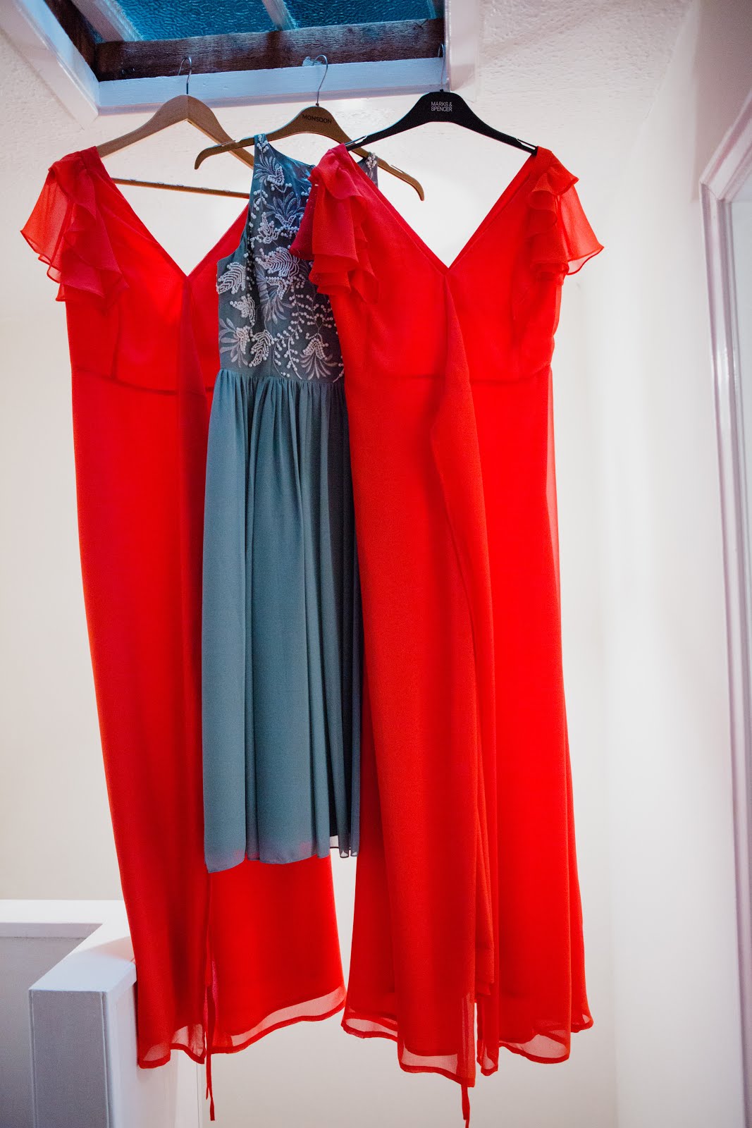
 |
| Pat's dress second to right |
Films
Originally, I had planned to continuously project a piece I edited together featuring scenes from some of our favourite films. However, this proved challenging and time ran out, leaving me with an incomplete film. Instead, I opted to play a couple of full films and trailers that inspired the wedding's theme, adding a touch of Italian film magic to the wedding reception.The trailers I included were for: Forbidden Photos of a Lady Above Suspicion, Le orme, Etoile, Red Rings of Fear, Short Night of Glass Dolls, The Heroin Busters, The Sweet Body of Deborah, Colt 38 Special Squad, Rome Armed to the Teeth, and Suspicious Death of a Minor.

Photography
I'd like to extend my heartfelt thanks to Edinburgh photographer Loraine Ross for capturing all the wonderful photos featured in this post. Loraine did an incredible job of photographing all the film elements and perfectly captured the mood of the day along with each individual detail. All images are copyright to Loraine Ross.

You put so much thought into this and your passion shows. Love the theme (those reds and blues!) and the photos. I'm sure it was a special day. Thanks for sharing!
ReplyDeleteThanks Daniel! A lot of work but a lot of fun! I know most people aren't interested in weddings but thought the film elements might appeal - glad you appreciated them!
Deletenow that's how you do a wedding!!! excellent
ReplyDeleteThis is fabulous! I'm already married (courthouse wedding), but I'd love to do a lavish, Bava-themed anniversary party some day.
ReplyDeleteYou certainly have a lot of great ideas up your sleeve. I will certainly try these tricks for my wedding this summer. But I don’t know if any of the Chicago venues would incorporate all these wonderful ideas. But I would certainly come up with something great for the event. Thank You!
ReplyDeleteThis place has such a romantic vibe. Wedding Venues in WNY
ReplyDelete